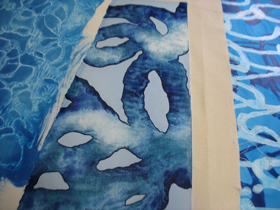
Showing posts with label Technical discoveries. Show all posts

Saturday, March 28, 2015

Frustration

When I went to bed last night after time spent in my studio, I left two almost-finished, awesome-looking paintings on my work table. As I was kicking off my slippers and climbing between the sheets, I thought, I have just one more layer, and I'm done! Then I can relish my two new creations.

Well, it didn't quite turn out that way. When I added the final layer just now, UGH. Yuck. Too much. No problem, I thought, it's acrylic, so I'll just rinse off the top layer and I'll be back to the wonderful surfaces I created last night.

No, not happening. Because it had only been about 5 hours since the original layers were created, the water began taking off everything. No problem, I thought. I'll just "go with it," and remove some color and have a soft muted surface.

Not in the cards. The sponge I applied smeared everything, leaving a blurred mess that showed no sign of last night's promise. Gone, bye, unsalvageable. And I have no more canvas, so I'd have to drive out to the store to buy more, and I really don't have enough money in my budget right now for new art supplies.

Sigh. Such is the creative process! Sometimes it works, sometimes it doesn't. I should take comfort in the fact that I HAD two cool paintings that, with effort, time and money, I will be able to duplicate to some degree.

As I was cleaning up my studio in frustration after this experience, I remembered other times in the past when I have been frustrated like this. Well, truth to tell, there are too many to possibly remember them all. That's part of being an artist!

But I remembered two paintings in particular that I really like, and that were a direct result of feeling so angry, desperate, and ready to SCREAM because nothing was turning out that I started slapping stuff on the canvas ... and these spontaneous emotional responses turned out to be much more visually rich than any kind of intentional application.

One of them is the painting "Hook," shown below. I had removed and reworked these large fabric pieces countless times, and still I hated the composition. I finally got so mad that I just pulled them all off the canvas and threw them on the studio floor. Then I had one last impulse to act; not an idea for a solution, mind you, but an undirected burst of energy. I grabbed them off the floor and just stuck them onto the canvas, letting them land anywhere they happened to land. And then I stepped back in amazement. Somehow, this worked better than any of the careful arranging I had just spent hours doing! My initial instincts for color and shape had been fine; I had just been "trying too hard." This remains one of my favorite paintings.

"Hook," acrylic and oil stick on fabric on canvas, 64" H x 44" W, 1998
A similar thing happened with another favorite, "Scribble 1." I was trying to create a collage, again arranging carefully, with torn pieces of paper. Nothing was working. After I tried and tried and tried, I felt frustrated that all of this work was amounting to a big zero. I didn't feel like spending all this time in my studio with nothing to show for it. I happened to have a blank stretched canvas nearby, and I grabbed it and started flinging the collage pieces onto it haphazardly, just gluing them down beside one another, wherever they happened to land.

And you know what? This cool painting resulted!

"Scribble 1," acrylic on paper on canvas, 48" H x 28" W, 2009
I guess there's something to be said for simply letting the painting paint itself. (Jackson Pollock's most famous quote deals with just this issue, and who am I to argue with The Big Guy?) But it's hard to do that! We want a good-looking finished piece to show for all this time spent, dammit! We don't want to have to start all over again from scratch.

Sometimes, however, frustration can lead to spontaneity, and that might be just the "breath of fresh air" that the painting needs.

Tuesday, December 16, 2014

Out of left field

I've just completed a pair of new works on canvas that, due to colorations, resemble landscapes. I love the idea of a vertical "slice" through the type of scene that is traditionally horizontal in format.

What prompted this change of pace, you ask? Nothing carefully considered, frankly - just the fact that my art budget for 2014 has run out, but my desire to create has not! So I am using up whatever stretcher bars, canvas lengths, and paint I have left over until the new year kicks in! (Both are acrylic on canvas, 20" high by 12" wide.)


Saturday, January 25, 2014

Looking good on paper

I decided to return to working on paper again for a change, after having painted exclusively on stretched canvas for a while. So I purchased a new pack of 30" x 22" paper, loaded up my squeeze bottles with fluid acrylics, and I was ready to go!

In this process, I draw lines with the squeeze bottle onto the paper, lay another piece of paper on top, and roll over it with a brayer, essentially making a monotype. The beauty of this process is that I am left with two replica images; one can be left as is, and the other can be reworked for as long as desired. This eliminates the disheartening "oh no, why did I paint over that - now I've wrecked it!" experience. (We painters are always lamenting that we don't have a "Control-Z" feature when we work ... )

I'm having such FUN!


Friday, August 30, 2013

Refashioning in the studio

Inspired by the book "Overdressed: The Shockingly High Cost of Cheap Fashion" by Elizabeth Cline (2012), I've done a lot of refashioning lately. You know the scenario: you decide you hate a garment (or ... everything in your closet!) and you just want to get the thing out of your sight. Maybe you've gained (or lost!) weight, or styles have changed, or you just can't figure out what you were thinking when you bought it in the first place. A thriftier and more eco-friendly solution than throwing the item in the trash, or even donating it to charity, is to whip out a pair of scissors and a needle and thread and change up the style. Instant and free "new" garment.

This technique of refashioning has worked well in my closet, so I figured, "Why not in my studio too?"

As with clothing dissatisfaction, I've always liked but not loved the following two diptychs. The squares were made in 2010 and the rectangles in 2012. They've all just sat in my studio because I didn't have enough faith in them to promote them. However, they're not so bad that I'd want to get rid of them. Enter the refashioning method.

Not bad, but ...
OK, but ...

Pretty good, but ...

Lukewarm ...

To make the change, I simply grabbed a pair of scissors and a gallon of gel medium, and voila, two canvas collages on canvas:

Flowing and energetic!

Elaborate and full of depth!

Here's how they look together as a diptych, which is how I would ideally display them:


I've very pleased with the results! It turns out that, just as with clothing, old paintings can be made new again with a little imagination.

Wednesday, May 22, 2013

Old materials, new results


As I wrote in an earlier blog post, "Painting within my means," 2013 is my year to pay off a lingering charge-card debt forever, which means I've been adhering to a strict policy of austerity. And for a former art-store shopaholic like me, that means no new art supplies until the bill is paid off (and from then on, careful consideration before a single penny is spent). I had planned on dealing with this year's restriction by working only in black and white, and re-using old stretcher bars and pieced-together canvas scraps.

That plan has worked fine for the first six months of the year, but I'm finding I'm almost finished with my latest black and white series. Being a person who only feels alive when I'm creating something new and, on top of that, a Gemini, I was beginning to wonder how to deal with the eventual day when I put the last stroke on my black and whites and then start to get antsy for the next project (not to mention a return to color).

An idea came to me this morning, when I thought of a collage I made in 2010 for the Icons + Altars show, which used to be an annual exhibit at the New Art Center in Newton, MA. That year, the deadline for creating a piece for the show was looming and I didn't have time to whip up anything new, so I recombined strips of several old paintings into this collage (below). I liked the result and the piece sold at the event, so I pocketed the proceeds and mentally filed away the technique for future reference.
"Wine Lines," acrylic on paper and fabric on board, 16" square, 2010

When I remembered that experience this morning, I thought of the piles of old paintings and drawings currently languishing in my studio, artworks which weren't bad enough to paint over or throw out, but weren't good enough to exist as finished works on their own. "Hey," I thought, "how about if I recombine them into entirely new pieces?"

So, working intuitively, I put together this collage on a 12" square cradled board I had lying around.

Not yet titled, acrylic on paper on board, 12" square, 2013


The interesting thing about this process is that these various paintings and drawings were made at completely different times (from approximately 2005 to 2012), and created without the idea of their ever coming together. So to combine them together now joins the various techniques and thought processes I've been working on over the years in new and interesting ways. Below are some possible combinations of old works I might try in upcoming collages. We'll see how this new direction unfolds!


Friday, May 3, 2013

Painting within my means


"Wing," spray-paint on canvas, 2001
Last June, I hit the half-century mark! It proved to be a fine opportunity to look back over the past 50 years and be thankful for my good fortune.

But one of the things I realized when I examined my life was the far less heart-warming fact that I had amassed more than $9,000 in debt on a charge card. I had nearly maxed out the card about five years prior and had managed to pay my balance down to 0. But like the dieter who hasn’t learned how to revise her eating patterns and regains the lost weight, I had savored the joys of freedom from debt for only a few months before I began repeating my old spending habits and found myself in the red again. Turning 50 woke me up. I realized I had better look carefully at my finances and figure out how to climb out of the hole I was in. PERMANENTLY.


One thing that was soon apparent was that I was spending far more money than I had to spare on my art career, both in the studio and in promoting my work. It wasn’t that I was going insane over art expenses, but I was definitely going beyond my means. I began to examine ways to curb these expenditures using a balanced approach, so that I was continuing to paint and to promote my work, but in a sensible and effective way.


Here are some of the methods I’ve found to do this, which I thought I would share on my blog in the spirit that few of us working artists have trust funds and likely could use some tips on how to keep art-related spending under control, without giving up entirely.


1. MANAGE YOUR WEB PRESENCE YOURSELF. One thing I did was to create my own free website, which I can maintain myself. I never really could afford to have a professionally created and maintained website in the first place, but I didn’t want to admit that to myself. So back in 2006, I hired a wonderful web designer to custom-create a site for me and then kept hiring her to completely revamp every page whenever I had a new series ready (which, because I was so prolific, was every few months). So while my website looked awesome, I was paying out far more money than I had available.


Then about a month ago, I saw that my Facebook friend, artist Alison Wells, had created her own website on Weebly.com. I thought it looked fantastic, and I decided to create my own using the same site. Weebly’s tutorial video said that a person, group or company could make their own site in a few hours, but because I’m an artist and had lots of images to upload, mine took about 6 hours to create. But I had such a blast doing it that it seemed more like 6 minutes!


Now I am NO computer expert, by any means. But I’m quite proud of the way the site looks, and I love the fact that I can maintain it myself and make changes easily and immediately, at any time of day, free of charge.


Also, please note that many blog sites are free to create and maintain, such as blogspot and wordpress. Blogs, while seeming to decline in popularity these days, are still a viable way to increase exposure to your artwork.


2. FIND FREE (BUT IMPRESSIVE) VENUES FOR EXHIBITING YOUR ARTWORK. Back when I was in denial about money, I used to apply to exhibits constantly, shelling out $50+ each month for entry fees. This process resulted in some fine opportunities for me – most notably, exhibits at the Marin County Museum of Contemporary Art in Novato, CA, and the beautifully appointed Peninsula Fine Arts Center in Newport News, VA. But again, that didn’t mean that I had the income to cover my habit.


So I began to look for opportunities to show my work that were free to apply to and participate in. I searched and found a number of locations that were soliciting calls for curatorial proposals, and this process revealed a way for me to turn my love of art writing and looking at other people’s art into free opportunities to show my own work as well. Most of these curatorial openings could be applied to on line, thus eliminating not only entry fees but also the exorbitant cost of office supplies such as CDs and covers, mailing materials, printer ink, and postage. My most recent experience with this type of venue was a four-person show I curated at Mount Ida College in Newton, MA. The gallery director and her staff of student interns hung the entire show exactly to my specifications, and the college printed a full-color catalog and provided a lavish opening reception for this exhibit. Some galleries also provide honorariums for public talks or cover other related expenses for artists or curators. So not only do you save money, you can also earn some.


3. INCREASE YOUR TECHNICAL KNOWLEDGE. I used to grab my charge card and shop online heedlessly whenever I ran out of paint. And sad to say, my tastes ran toward Golden Paints, the most expensive brand out there. Their colors are breathtakingly beautiful, but cost more than $50 per bottle. I was spending upwards of $500 per month on art supplies, and my income simply could not support that.


In addition to being an artist, I am a painting instructor and, ironically, one of the things I teach my students is how to start with primary colors and mix the myriad of possible combinations themselves, rather than buying secondary colors (available from mixing primaries) or earth tones (available by mixing complements). When I looked over my budget, I realized that I should be taking my own advice. Now I buy basic paint colors in less expensive brands and mix my own colors. It’s a far less opulent approach than buying whatever I want from Golden’s luxurious range, but it’s far more affordable.


I also used to spend approximately $300 (gasp) every few months on rolls of cotton canvas from the art supply store. Again, too expensive for my budget. But I’ve found a $4.99-per-yard unbleached cotton from the local fabric store. Last time I went there to buy some, the store employee unrolled the bolt of fabric to cut a length for me and I noticed a continuous stain running length-wise down the cloth. She offered me 75% off, so I ended up paying less than $1 a yard. Since I'm just going to gesso over the surface, the stain will never show.


4. EDUCATE YOURSELF ABOUT MONEY. I have read countless money advice books (checked out of the library, of course) in the past year, mostly ones that were published or updated since the recession, since so much has changed since 2008. Most art career books don’t discuss budgeting or finances specifically, and most financial advice books are written for people who know exactly when/where their next paycheck is coming from (something artists often can’t say for sure). I have found these two to be the most helpful, as they include chapters geared specifically for "consultants" with irregular incomes (a.k.a. artists): “Seven Money Rules for Life: How to Take Control of Your Financial Future” by Mary Hunt and “The Debt-Free Spending Plan: An Amazingly Simple Way to Take Control of Your Finances Once and For All” by JoAnneh Nagler.


These are just a few of the many ways for a cash-strapped artist to keep painting while staying in the black.


Although I am still paying off my debt, it is now more than halfway gone, and I plan to continue paying it off while maintaining a serious art practice. Every last penny owed will be paid by December 1, according to my calculations. And when that day dawns, armed with the many new solutions and techniques I have learned, I am confident that I will never find myself in debt again.

EDITED TO ADD: As of November 7, my debt is completely paid off! :-)

Thursday, July 14, 2011

Should I stay or should I go?

One of the hardest things about painting is deciding how to proceed when things aren’t going swimmingly. At that stage, you have to choose between two distinct directions: either you keep working (and risk wasting time and supplies on a dead end) or you chuck it (allowing yourself to move on to something new armed with the knowledge you’ve just gained).

You don’t want to give up too soon, before the image reveals itself. But you also don’t want to “beat a dead horse,” so to speak.

I’ve made both decisions over the past week, with two different paintings, and I feel satisfied that I made the right choice in each case. But the fact that they came right on the heels of one another reminded me of what a dramatic (and quite personal) part of the creative process they represent.

I had a large painting going over the weekend and it just STUNK. Unfortunately I had worked on the most crucial part in my process, laying down the colored stripes, at a time when I was very emotionally upset about something. I was so freaked out about this personal matter that it clouded my decision-making process, and once those colors had been laid down, it was hard to change them completely.

So I tried painting over the painting with a solid color, figuring I’d start again. But it took two coats to cover all of the dark-valued tones on the surface, and by the time those two layers had been applied, the surface was completely smooth. There was no longer any way for me to play with the canvas texture, which is an important part of the “look” I am trying to achieve with this series.

This was an easy decision to make, since the painting had three strikes against it: mottled starting ground, surface too smooth for interesting marks, ugly second try. I grabbed my scissors and felt immense relief as I removed the offending canvas from its stretcher bars.

And you know what? This decision led to another large canvas that turned out WONDERFULLY. I had learned many things from that last flame-out, and was thrilled with the result of this new one.

Then the opposite happened yesterday. I had been working on 56” H x 50” W canvases, and I decided to try some small examples of this series as well. (Always good to keep those compositional muscles in fighting trim.) So I stretched three 20” H x 14” W canvases and jumped in.

The first canvas got to an ugly stage. Muddy colors, no interesting distance relationships, blobs where I had wanted lines. I tried a number of remedies, none of which worked. Then I started to feel sleepy, so I stopped to take a nap. While I was napping, I thought of a whole new direction I might want to go in, so I returned to the studio, planning to grab the scissors and start again on a fresh strip of cloth.

But when I saw the current painting hanging on the wall, there were a few things about it that I really liked and that I knew I couldn’t ever duplicate exactly. So I added a second layer of color to one section and completely recolored another section, thus managing to reshape some of the lines. MUCH BETTER. I’m really glad I continued working on this one. (Shown below.) Whereas the previous one was just going nowhere and would have been nothing but a waste of time to continue pushing.

Another of the wonderful things about being a painter. You are constantly traveling down the pathway of discovery and being faced with that crucial question: should I change directions or is it just a matter of continuing on until I find what I’m looking for? An ongoing adventure, that’s what it feels like to me.

Tuesday, June 28, 2011

The right tool for the job

Under the category of "I wish someone had told me this, but no one did, so I'm telling you": When wrapping and/or shipping artwork, use BROWN CELLOPHANE TAPE to secure the bubble wrap around the painting. It holds the bubble wrap firmly in place, but peels off easily so you can reuse the bubble wrap. Masking tape, clear cellophane tape, and certainly duct tape stick so stickily to the bubble wrap that they only rip it up when you try to remove them. This is what professional art movers use.

Friday, June 24, 2011

Looming large

Still a few finishing touches to go, but I've mostly completed the first in a group of 56" high by 50" wide paintings. As I've mentioned in earlier blog posts, I've felt an undeniable urge lately to expand the size of my canvases, the result of increased confidence as an artist and the desire to say what I mean more clearly and boldly. I also feel as though the bigger scale will avail opportunities for display in more serious exhibition spaces. We'll see ... meanwhile, off to an exciting start!


ETA: It's interesting to note, for any of you color theorists, that the yellow-white inside the bottom row of loops and along the top of the canvas is THE SAME COLOR. I don't know yet if it's the lighting setup or an optical illusion created by the colors nearby, but they appear to be very different. The one at the top looks almost like an orangey-cream, and the one inside the loops looks like pure white.

Saturday, April 9, 2011

Bridging two worlds

Somewhere along the line, in my development as an artist, I got the idea that precision was wrong.

I always had a facility for drawing tight details, which I developed throughout high school with carefully rendered fashion illustrations. I continued to work this way as I went on to earn a diploma in fashion design, creating drawings like the one below, with each fleck of the tweed a tap of the marker tip on the page. These drawings took hours and hours, even days, and I loved making them.


Perhaps the trouble started when I decided I wanted to study fine art. I still remember the horrified look on the admissions counselor’s face at the Art Institute of Boston when she saw my fashion drawings. (That was what I included in the application for my interview, since I had just graduated from fashion school and had worked very hard on my portfolio.) I think she thought I was drawing in that style because I didn’t know how to draw realistic figures, rather than the truth, which was that I had been intentionally aiming for a stylized “fashion figure.”

“You won’t be able to transfer any credits,” she said gravely as she continued to flip through my portfolio and shake her head.

Being young and impressionable, I absorbed her opinion that there must be something non-artistic, not valid about these drawings. Rather than question her, I decided that this program was just what I needed, and threw myself into my fine art studies.

As I went through art school, I tried very hard never to work tightly and with detail in my artwork. I figured that had to be “wrong.” What was “right” was working loosely, intuitively, with flowing gestures and generalized shapes. And since working this way seemed to come as naturally to me as working in tight detail had, I just went with it.

I was further steered in the “fine art and illustration don’t mix” direction when I had this interview after graduate school.

But I had an epiphany when I was making a demonstration painting a few weeks ago for one of my watercolor classes. I had been teaching watercolor for years, and always approached it with my art school “loose is good” training. I got frustrated when doing demonstrations for my students because my watercolors always lacked finesse; in fact, they just looked like a mess. I figured I just wasn’t a good watercolorist.

For this recent class, though, I wanted my students to learn to follow intricate nooks and crannies, so I had each of them paint a closeup of a spinach leaf. Since it was a new project idea and I didn’t have an example to show the students, I worked on the project along with them during class.

I instinctively grabbed a tiny pointed brush -- the kind I would have avoided like the plague in art school -- and proceeded to go back in time to reconnect with that ability to describe fine detail that had been my forte since high school. And I came up with this wonderful painting, the best watercolor I’d ever done.


I am happy to say that this acceptance of detail has spilled over into my “real” painting in my studio. I have been able to combine the loose, flowing quality I’ve been working with since graduate school, with the tiny brush details I’ve recently rediscovered. The contrast of loose and tight has made for a new and exciting direction for me, as evidenced in my newest artworks (like the one below, just completed).


I have to say, growing older is turning out to be a wonderful experience for me. As each day and month and year passes, I throw away more and more of the assumptions of my youth, the misconceptions I gleaned from others, either their wrong-thinking or my misinterpretation of what they meant. Either way, it’s very freeing, and is revealing the true me, what I honestly believe and what I am capable of.

Saturday, March 19, 2011

Studio happenings in March

As I mentioned in this earlier blog post, my art career stuff has slowed down, and therefore I am using this as an opportunity to plunge in to a bunch of new series, ONLY with a care toward what I feel like doing rather than what I am obligated to do.

Interestingly enough, now that my mind is clear and not bogged down with any specific exhibition or application deadlines or expectations, definite creative steps are presenting themselves to me. I have four series going at once, all quite different, but they are all an important part of what I want to say right now.

First, I have just had a taste of the creme de la creme of spray paints, and now I can never go back! (It's like eating your first piece of Godiva chocolate, when you're used to M&Ms.) I usually use Krylon, but they have recently redesigned their caps so that it's hard to get any specific sized marks. Enter Montana Gold!! This brand of spray paint goes on much more smoothly and solidly, it's far more comfortable to work with (i.e. the nozzle depresses more easily, so I don't have to tape my fingers to avoid blisters), and it comes with a series of caps that produce lines in different widths. (Plus it's not as smelly.) Heavenly!

I bought one can in "Mustard" color, and started to try it out, as shown below, in a 20" square collage. But I like the possibilities of this painting so much that instead I am going to cover more fabric with spray paint lines and collage the cut pieces onto a 40" square canvas. Tomorrow, the garage becomes a spray paint booth again! :-)


Next, I've finished 6 paintings in the Tapestry series (example of one of them, below), and I wanted to created 6 more in a cool color version. I tried making the painting below but wasn't satisfied with the colors. So I worked out a better color scheme on paper, and am going to test that out on an actual canvas this weekend.


I've finished 5 in the Frosty series (example below), so now I have Lemon, Vanilla, Raspberry, Strawberry and Pistachio. Since they have a very reflective silver surface, they are going to need to head to the professional photographer's. They are all wrapped in their little plastic raincoats, ready for the trip.


I also have plans to expand the shoe drawings I've done so far into a more specific series of illustrations with a more conceptual twist. More on that to come.

I have to admit, it feels strange to be doing all this for no specific purpose. I think this is the first time since graduate school (1997!) that I have worked so diligently without any definite end purpose for the work, such as a planned show, sales opportunity, or invitation to apply for something. It's like taking steps in the dark, guided only by my creative muse. But creating with this kind of intensity is what I live for ... it's what I work at my day jobs for, it's what I have simplified my life for. I can't not do it, illogical as that may sound.

Tuesday, February 1, 2011

Fine art needs time to ripen

I like the new painting I made last Saturday so much (shown left), that I've spent a lot of time just sitting and looking at it since then. (Which is a good sign, that a painting continues to interest you and inform you as time goes on.)

This piece encompasses exactly what I want to say as an artist, and it solves a lot of interpretive and technical problems that I've been dealing with since last year. (Such as, how to combine color and value in a way that allows various under-layers to show through in certain random spots? What is the best format for suggesting that the space moves on and that the lines are in constant motion and reconfiguration, tangling and untangling? Etc.)

As I was looking at it yesterday, a memory of an older painting popped into my head. I made "Snarl" (below) in 2005, using acrylic and spray paint on canvas. I realized when I thought of it yesterday that it shares its size (30 inches square), format, color scheme, basic composition and thematic references with Saturday's painting.


Much as I like "Snarl," though, I think the new work represents an advancement. The colors are more refined, the lines are freer and more expressive, and there is greater evidence of a personal voice. I see by comparing the two how many hours I've spent learning to use color, learning to apply and layer paint, and learning how to make my work say what I want to say. It's taken every minute I've spent in the studio over those six years to accomplish this.

As someone who is VERY impatient and wants everything NOW (I can barely stand to wait for my quick-drying acrylics to dry!), I'm recognizing as I'm getting older how long it takes to really learn how to paint, to really come to terms with what you want to say as an artist and to figure out how to say it. Like fine wine, a painter's technical ability and her understanding of herself must slowly develop over time. Years, decades, of work.

It's taken me 48 years to understand that time passing is a good thing. Our culture teaches us that youth is king, that aging is something to be feared, concealed and denied. But I'm discovering that getting older is a privilege. With age comes wisdom and understanding. One's age represents all the experiences it's taken to get you where you are.

And I admit, I can't help thinking, "If I've come this far in six years, think where I'll be in six more years!!"

Friday, December 10, 2010

Trials, tribulations, and finally success!

I've spent the last few days wrangling with a painting. I tried a reddish brown surface. Not too bad, but not good enough. I tried adding more color. UGH. Start again: painted it over with white paint.

I tried a watery black surface. It looked great on a smaller painting I'd made earlier. But not this time. UGH. I tried getting a bit darker. UGH. Too dark. Start again: another coat of white paint.

I tried a green/black combination. It had also worked on a smaller version. UGH. I tried adding a layer of black and gel medium. UGH. I tried adding a layer of green. UGH. Start again: another coat of white paint.

So I got up this morning and was faced with that white surface again. I'd run dry of ideas. Randomly, my hand reached for a nearby tube of orange/brown paint, and I just squirted it all over the surface and rubbed it in with a brush.

Excellent!! Done!!

I know many other artists make preparatory drawings, sketchbook studies, color swatches, gridded compositions, and many other practices to plan out their intentions for a painting. I CAN'T! Ironically, I am an extremely organized person in all other areas of my life. But when it comes to painting, I have to be spontaneous, or nothing works out.

Painter Rebecca Crowell describes her artistic process, which shares a lot in common with mine, in today's post on her blog. I recommend reading her thoughts, especially if you're one of us "listen to the painting" types.

Sunday, December 5, 2010

Going green with Fruit of the Loom

For reasons of pride (and, as my grandmother always said, "What if there was a fire and the firemen had to carry you out?"), I guess we all have regular purges of our old well-worn underpants.

I just bought a raft of new undies at Target and, in the spirit of "going green," decided I could use the old ones as painting rags. It makes you feel like you're really doing something for the environment! Since, let's face it, that's one contribution of "old clothes" that the Salvation Army isn't going to thank you for.

Wednesday, November 10, 2010

Studio happenings

Welcome to my studio this morning! Here are a few new pieces. This one (40 inches square) I just completed and I'm happy with what happened. I wasn't able to apply the final blue wash evenly (if you go over any one area too many times, the white lines get covered), but this ended up creating depth and a sense of a downward vertical rushing movement.


Here's a smaller piece (20 inches square) that didn't turn out as expected, but I like what happened:


By accident, I discovered this dry brush technique (the light areas), so I think I'll try it again on a larger painting.


And here's a little shot of my studio floor! Don't wear your new Manolo Blahniks in here.

Sunday, September 12, 2010

Meeting a new color

I've been going on the theory that it's better to understand a color by working with it on its own first, THEN seeing how it interacts with others. I created this piece yesterday, using green, a color which I seldom use. I'm starting to get a feel for the possible values with this particular green, how dark and light it can get before it starts to suggest depth. When I feel like I'm getting the hang of it, I can expand its three-dimensionality with other colors.


Here's what I mean: I started with just an orange, as in this piece ...


Then felt comfortable enough to integrate it with variations:


Along with this step-by-step process comes an understanding of the emotional impact of the various colors, a non-verbal sensing that, once felt, is never forgotten.

Next, I'm going to try working with a different green (I have Golden's Green/Gold waiting in the wings).

Monday, August 30, 2010

Acrylic paint comparisons

I am about to start a new series in red, a color I don’t use much, so I thought I would take an inventory of the red paints I have already in the studio before I start making any definite color decisions or purchases.

This swatch-painting exercise caused me to evaluate the qualities of the various brands I have on hand, and I thought my findings might prove interesting to other acrylic painters.

Please keep in mind that these observations reflect my personal preferences; your mileage may vary.

First of all, Golden’s brand, the best you can buy. BUT they are so damned expensive, one purchase can max out your credit card. I use them sparingly, for top-most layers. But they have power-packed pigment quality and an exquisite palette to choose from. They also come in a range of consistencies, the cream-like fluid variety being my favorite as I am a squeeze-bottle aficionado.

Utrecht’s acrylics are terrible. They are super thick (even when not specified as “heavy body”) and can’t be diluted evenly. No matter how carefully you try to water them down, you still get watery patches alternating with undiluted blobs. They also have very poor pigment quality; it would take at least a few layers to get a truly opaque surface (and I was using reds, one of the most opaque paint colors, so cool colors would take even more coats).

That said, I adore Utrecht’s acrylic additives (matte medium, gel medium, and modeling paste); they are versatile, archival and inexpensive.

“Blickrylic” paints, sold as a student-grade acrylic by Dick Blick, have a marvelous texture – just soft enough to spread easily, not watery at all. Plus they dilute evenly if that’s what you want. Their pigments are strong – not as strong as Golden’s, but strong enough for initial layers on the canvas. The colors aren’t anywhere near as beautiful as Golden’s – in fact, they’re fairly flat and generic – but once you start layering with them, your own personal vocabulary will take over and you can come up with some lovely and unique results.

On the other hand, my experiences with Dick Blick’s acrylic mediums have varied. They are great for image transfers (read also my blog entry on this subject, here), but they are terrible mixers with colored paints and they don’t work at all as adhesives.

Those are the three brands I have on hand, and I learned a lot, just from a few minutes of testing the jars on my shelf.

Monday, August 2, 2010

Steps of a Painting: Part 1

I thought I would document the steps I take when creating a painting.

This particular series has an unusual genesis, in that I envisioned my direction right from the beginning, and I pictured the colors right from the beginning. I tend to be one of those "throw a bunch of stuff at the painting and see what happens" type of painters, but with the last few series I've made, I knew exactly where I wanted to go before I began.

I knew from the start that I wanted to continue with the steps I used to make the painting to the left ("Desert 3," acrylic on canvas, 44" H x 30" W), which is the last one I made. But this time, I wanted to use ice cream types of colors like vanilla, pistachio, strawberry and black raspberry. Perhaps this is influenced by my recent dieting habits, which have involved cutting out sugar! A craving coming out in paint form, perhaps?! ;-) Maybe an expression of the season, or maybe nothing that complex.

In painting terms, this means variations of turquoise, alizarin crimson, quinacridone violet, nickel azo yellow (Golden's fluid acrylics), and of course white.

So here are the first layers. I toned 2 canvases (50" x 30") in a combination of white and red (I use Blickrylic acrylics for the toning layer for reasons of economy. (The half-gallon containers are comparatively inexpensive.) When the surfaces had dried, I applied rows of watered-down (but still dark) turquoise and quinacridone violet in varying placements and widths.

By the way, I like to work on several paintings at once. This way, no one piece ever gets overworked, and I can practice slight variations and see how they look at the same time. I also tend to create triptychs these days, frankly for reasons of sales (groupings tend to be easier and more lucrative for the art consultants I work with to sell). Plus you can TRIPLE YOUR PAINTING FUN this way, without much additional elbow grease! (It only takes a few minutes more to stretch 2 or 3 canvases at a time than to stretch 1.)

Once this set of colors has dried, it will be time to apply the next layer, this time tinted versions of the colors I've just laid down.