
Showing posts with label Steps of a Painting. Show all posts
Showing posts with label Steps of a Painting. Show all posts
Monday, November 3, 2014
A touch of red
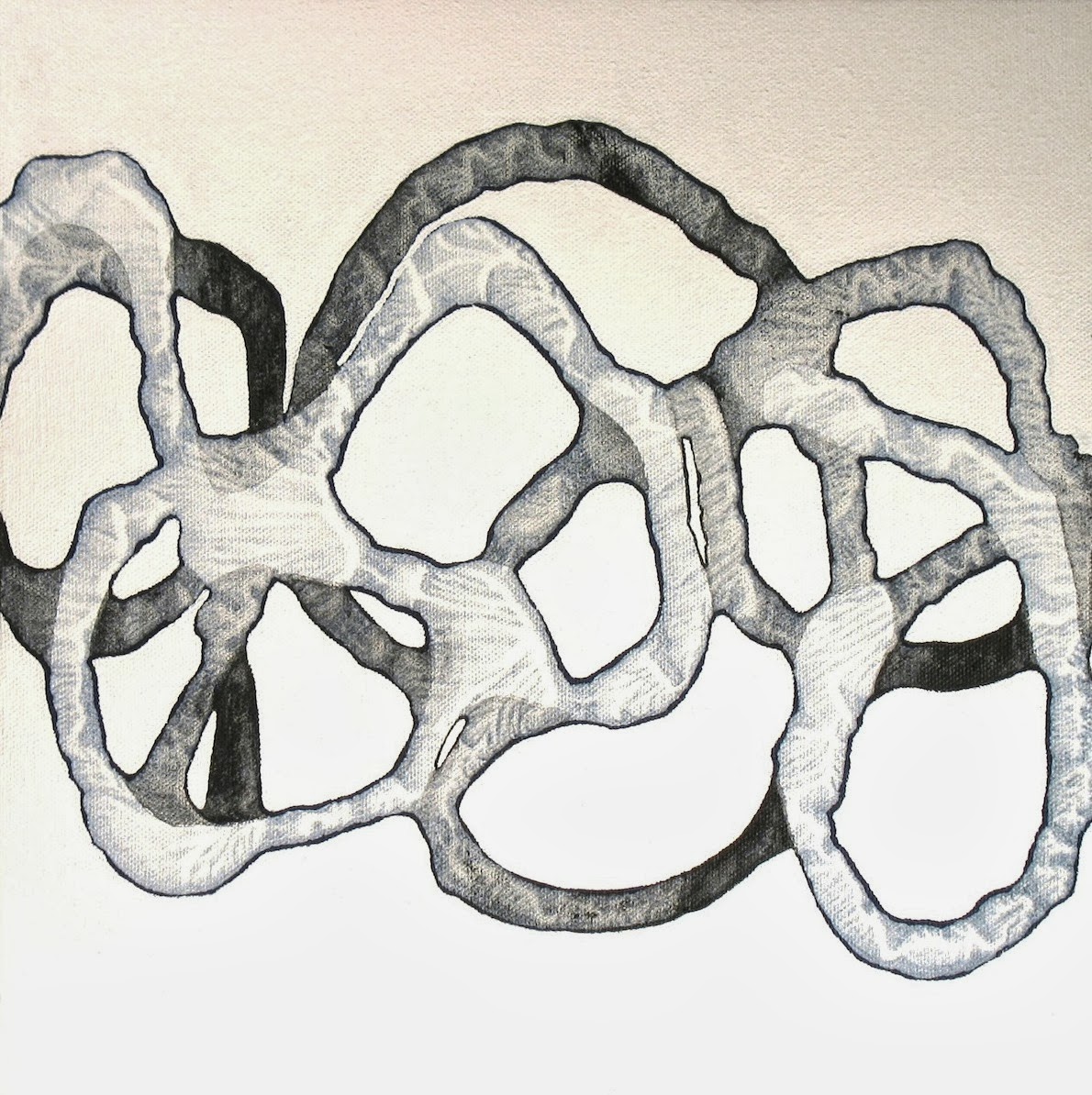
To switch gears a bit from my recent drawings, tonight I'm patterning some lengths of fabric in anticipation of creating a new collage painting. I enjoy switching modes like this. Some times I feel like working in a detailed manner, as in the precise "bubble" drawings I've been making for the past few months; other times my arm just wants to SWOOP!

Saturday, January 25, 2014
Looking good on paper
I decided to return to working on paper again for a change, after having painted exclusively on stretched canvas for a while. So I purchased a new pack of 30" x 22" paper, loaded up my squeeze bottles with fluid acrylics, and I was ready to go!
In this process, I draw lines with the squeeze bottle onto the paper, lay another piece of paper on top, and roll over it with a brayer, essentially making a monotype. The beauty of this process is that I am left with two replica images; one can be left as is, and the other can be reworked for as long as desired. This eliminates the disheartening "oh no, why did I paint over that - now I've wrecked it!" experience. (We painters are always lamenting that we don't have a "Control-Z" feature when we work ... )
I'm having such FUN!


In this process, I draw lines with the squeeze bottle onto the paper, lay another piece of paper on top, and roll over it with a brayer, essentially making a monotype. The beauty of this process is that I am left with two replica images; one can be left as is, and the other can be reworked for as long as desired. This eliminates the disheartening "oh no, why did I paint over that - now I've wrecked it!" experience. (We painters are always lamenting that we don't have a "Control-Z" feature when we work ... )
I'm having such FUN!
Wednesday, January 1, 2014
More of what made 2013 a great one!
As the sun rose on the first day of the New Year, I thought, "Why should 2014 be any different from 2013? Let's get painting!" So I headed directly to the studio and created the first layer of a new collage piece, shown here. Looking forward to a productive winter ahead!

ETA: Here is the resulting painting (not a great shot, but you get the idea):


ETA: Here is the resulting painting (not a great shot, but you get the idea):
Thursday, September 26, 2013
Emulating Ernst: An Art History Lesson
 |
| Ernst's decalomania |
One of my colleagues, an art history professor, kindly attended the closing reception last night of the three-person show I've just participated in at Framingham State University, titled "Actions \ Reactions." During her visit, she noted the textured surface of the script-like lines in my paintings and told me they reminded her of a process utilized by the Surrealists, Max Ernst in particular, titled "Decalomania."
I'm so grateful to her for this observation because, while I was generally familiar with the series in which Ernst used this technique, I didn't know much about it and certainly had never made the connection between that method of working and what I do in the studio.
Decalomania basically means making a print from a coating of still-wet paint. When the two surfaces are pulled apart, their squishy separation causes a series of intricate ripples that look as though they are the result of painstakingly applied brushwork. And of course they are anything but painstaking! Those little rivulets aren't controlled by the artist at all; like so many interesting surfaces in art, they "just happen."
When I make my line paintings, I "draw" the lines by extruding diluted acrylic paint through ketchup bottles. The lines that flow out of the squeeze bottles are rounded and precise, and often I want them to look flat and wavery. So I lay a sheet of paper on the wet surface, flatten it with a brayer, and peel it off, leaving tiny facets inside each line. That's my personalized version of decalomania!
 | |
| Detail of "Shorthand" by Catherine Carter, acrylic on canvas, 2013, approximately 40" square |
I found THIS extensive blog post about the process, and its use by Ernst. This writer suggests that decalomania might have saved Ernst's life! Apparently when he was fleeing Vichy France in 1940, he was stopped just as he was about to board a train bound for Spain. A suspicious official rifled through the belongings he was carrying, which included rolled canvases that happened to include the decalomania technique. The man saw the elaborate "ribbed" sections of Ernst's works and thought he must have painted those areas with a tiny brush. He pronounced, "You, sir, have great talent" and escorted Ernst to the train. (If he hadn't been so transfixed by the technique, he might have been more aware of the works' "untraditional" content and taken the artist into custody!)
HERE is another interesting link about Ernst's masterpiece, "Europe After the Rain II," an oil painting chock full of decalomania.
 |
| "Europe After the Rain II" by Max Ernst, oil on canvas, 1940-42, approximately 2 feet high by 5 feet wide. |
Friday, August 30, 2013
Refashioning in the studio
Inspired by the book "Overdressed: The Shockingly High Cost of Cheap Fashion" by Elizabeth Cline (2012), I've done a lot of refashioning lately. You know the scenario: you decide you hate a garment (or ... everything in your closet!) and you just want to get the thing out of your sight. Maybe you've gained (or lost!) weight, or styles have changed, or you just can't figure out what you were thinking when you bought it in the first place. A thriftier and more eco-friendly solution than throwing the item in the trash, or even donating it to charity, is to whip out a pair of scissors and a needle and thread and change up the style. Instant and free "new" garment.
This technique of refashioning has worked well in my closet, so I figured, "Why not in my studio too?"
As with clothing dissatisfaction, I've always liked but not loved the following two diptychs. The squares were made in 2010 and the rectangles in 2012. They've all just sat in my studio because I didn't have enough faith in them to promote them. However, they're not so bad that I'd want to get rid of them. Enter the refashioning method.
To make the change, I simply grabbed a pair of scissors and a gallon of gel medium, and voila, two canvas collages on canvas:
Here's how they look together as a diptych, which is how I would ideally display them:

I've very pleased with the results! It turns out that, just as with clothing, old paintings can be made new again with a little imagination.
This technique of refashioning has worked well in my closet, so I figured, "Why not in my studio too?"
As with clothing dissatisfaction, I've always liked but not loved the following two diptychs. The squares were made in 2010 and the rectangles in 2012. They've all just sat in my studio because I didn't have enough faith in them to promote them. However, they're not so bad that I'd want to get rid of them. Enter the refashioning method.
 |
| Not bad, but ... |
 |
| OK, but ... |
 |
| Pretty good, but ... |
 |
| Lukewarm ... |
To make the change, I simply grabbed a pair of scissors and a gallon of gel medium, and voila, two canvas collages on canvas:
 |
| Flowing and energetic! |
 |
| Elaborate and full of depth! |
Here's how they look together as a diptych, which is how I would ideally display them:

I've very pleased with the results! It turns out that, just as with clothing, old paintings can be made new again with a little imagination.
Friday, May 10, 2013
Final stages of "Suspense"
One of my current projects, a group of five paintings on stretched canvas titled "Suspense" (each piece is 56" H x 12" W), is moving a step closer toward completion. Today I hung the five canvases together on my dining room wall (the only wall in the house that is bare and large enough to accommodate them - hence the light switch and electric socket!), so now I can see generally how they will look when on public view. I have a show coming up in early September that I want to include them in, so I need to complete the series before my busy summer teaching schedule kicks in. They still need a few coats of white to finish off the background areas and sides, and then we'll be ready to take this show on the road.

Here are some of the earlier steps in the process. This shot was taken in February, when I first got started:


And this picture was taken in April:

We're getting there!

Here are some of the earlier steps in the process. This shot was taken in February, when I first got started:

This was the next phase, shot in March:

And this picture was taken in April:

We're getting there!
Wednesday, August 25, 2010
Steps of a Painting: Part 2
 It's been since August 2 that I was working on some new pieces and had the idea of documenting their creation (in this blog entry).
I didn't plan to paint at all today. Even though I'm supposedly on "vacation," I've accomplished a lot of art-career-related projects today, and I was just going to sit and relax for the evening.
BUT I made the mistake of watching an American Masters episode on Robert Motherwell. All it took was a few minutes of watching him work in his studio, moving various shapes around, and talking about the fact that to him, abstraction is an expression of the human experience, not simply "design." The remote control slipped from my hands, and I found myself sprinting toward the studio, my heart beating with inspiration and anticipation.
The only thing I had stretched was the two paintings I had started for my Steps of a Painting series. These were paintings that I had a specific plan for, but I was in the mood to just spew paint rather than follow a pre-laid plan. So I've tried to keep on with what I was doing when I started, but at that time, I was inspired by the summer heat and sherbert colors, and today I'm not feeling that at all. It's cold and raining outside, and has been for 3 days, plus my fall semester starts next week.
That's an important realization about my painting: it's such an expression of who I am and what I'm feeling in the moment, that after 3 weeks have elapsed, there's no way I can expect to be on the same track! After all, I'm not the same person any more.
Anyway, I added some more layers to the two paintings: another layer of color and some rows of loops. But I am not at all convinced about continuing with this direction. I might just scrap these works and try something else! I'll add one more layer and see how I feel when they dry.

Monday, August 2, 2010
Steps of a Painting: Part 1
I thought I would document the steps I take when creating a painting.
This particular series has an unusual genesis, in that I envisioned my direction right from the beginning, and I pictured the colors right from the beginning. I tend to be one of those "throw a bunch of stuff at the painting and see what happens" type of painters, but with the last few series I've made, I knew exactly where I wanted to go before I began.
 I knew from the start that I wanted to continue with the steps I used to make the painting to the left ("Desert 3," acrylic on canvas, 44" H x 30" W), which is the last one I made. But this time, I wanted to use ice cream types of colors like vanilla, pistachio, strawberry and black raspberry. Perhaps this is influenced by my recent dieting habits, which have involved cutting out sugar! A craving coming out in paint form, perhaps?! ;-) Maybe an expression of the season, or maybe nothing that complex.
In painting terms, this means variations of turquoise, alizarin crimson, quinacridone violet, nickel azo yellow (Golden's fluid acrylics), and of course white.
So here are the first layers. I toned 2 canvases (50" x 30") in a combination of white and red (I use Blickrylic acrylics for the toning layer for reasons of economy. (The half-gallon containers are comparatively inexpensive.) When the surfaces had dried, I applied rows of watered-down (but still dark) turquoise and quinacridone violet in varying placements and widths.
By the way, I like to work on several paintings at once. This way, no one piece ever gets overworked, and I can practice slight variations and see how they look at the same time. I also tend to create triptychs these days, frankly for reasons of sales (groupings tend to be easier and more lucrative for the art consultants I work with to sell). Plus you can TRIPLE YOUR PAINTING FUN this way, without much additional elbow grease! (It only takes a few minutes more to stretch 2 or 3 canvases at a time than to stretch 1.)
Once this set of colors has dried, it will be time to apply the next layer, this time tinted versions of the colors I've just laid down.


This particular series has an unusual genesis, in that I envisioned my direction right from the beginning, and I pictured the colors right from the beginning. I tend to be one of those "throw a bunch of stuff at the painting and see what happens" type of painters, but with the last few series I've made, I knew exactly where I wanted to go before I began.
 I knew from the start that I wanted to continue with the steps I used to make the painting to the left ("Desert 3," acrylic on canvas, 44" H x 30" W), which is the last one I made. But this time, I wanted to use ice cream types of colors like vanilla, pistachio, strawberry and black raspberry. Perhaps this is influenced by my recent dieting habits, which have involved cutting out sugar! A craving coming out in paint form, perhaps?! ;-) Maybe an expression of the season, or maybe nothing that complex.
In painting terms, this means variations of turquoise, alizarin crimson, quinacridone violet, nickel azo yellow (Golden's fluid acrylics), and of course white.
So here are the first layers. I toned 2 canvases (50" x 30") in a combination of white and red (I use Blickrylic acrylics for the toning layer for reasons of economy. (The half-gallon containers are comparatively inexpensive.) When the surfaces had dried, I applied rows of watered-down (but still dark) turquoise and quinacridone violet in varying placements and widths.
By the way, I like to work on several paintings at once. This way, no one piece ever gets overworked, and I can practice slight variations and see how they look at the same time. I also tend to create triptychs these days, frankly for reasons of sales (groupings tend to be easier and more lucrative for the art consultants I work with to sell). Plus you can TRIPLE YOUR PAINTING FUN this way, without much additional elbow grease! (It only takes a few minutes more to stretch 2 or 3 canvases at a time than to stretch 1.)
Once this set of colors has dried, it will be time to apply the next layer, this time tinted versions of the colors I've just laid down.


Subscribe to:
Posts (Atom)